Showing posts with label advertising/design. Show all posts

Tuesday, September 11, 2012

Photoshop Magic

Whenever someone finds out that I "know" photoshop one of their first questions is about altering photos and what kind of "magic" I can do. I thought I'd share this recent example...

I really wanted a photo of my daughter and my cousins son (they are 4 months apart, my cousin and I are 3 months apart) together, since we don't see them very often. Well as you can probably guess, the two toddlers never did manage to look at the camera at the same time.

Original 5 shots

Best shot of Jillian

Best shot of Milo

Final photo of the two of them. Can you tell that it's 2 pics put together in photoshop?

Tuesday, March 24, 2009

stltoday.com


The St. Louis newspaper website has launched a new logo. I was never a fan of the old one, so this new one is an improvement in my mind. I would have used a different font though - similar but with less definition in the bottom of the "d" and "a" and the top of the "y". Also, the arch cut into the "tl" is awfully thin and would all but disappear if the logo were to be any smaller.

Monday, March 23, 2009

Did you notice it?


New logo alert - I noticed on a Jack in the Box commercial last night that it ended with a new logo. Of course I said to myself, is that a new logo or just something special for the commercial?

Low and behold, the fast food chain has reinvented itself and has plans to revamp the restaurant atmosphere as well. I have to say that I like this new logo!

Friday, August 22, 2008

I own a company!

Big news that I can't believe I didn't post about 2 days ago when it became official......

I am now the business owner of Jenny Kyle Design, LLC!

Tuesday, August 19, 2008

ABCs of St. Louis


This is kind of fun, even though it's from stltoday.com....Alphabet City. For each letter of the alphabet, it shows you 4 characters and you must choose the one from the description at the right.


Of course, being a designer I'd rather know where all the letters are from, not just the one that answers the question. Maybe they could add that in....tell you which one is correct, but tell you where the incorrect answers are from. They also repeated way too many signs (including letters of the same sign over and over). I swear I recognized several from my St. Louis Walls project from my senior year of college.

Monday, August 18, 2008

Do you see any resemblance?


I saw the Kentucky plate on a car in front of me on my way home from work today. Awfully similar to the ugly plates that Missouri just launched if you ask me...however, Kentucky released theirs in 2005.

Sunday, August 17, 2008

New Logos: Econo Lodge and Super 8

On a recent drive to Rolla, I noticed 2 new hotel logos on billboards...following in the footsteps of such previous hotel logo redesigns as LaQuinta and Comfort Inn, Red Roof Inn and Four Points Sheraton that I've previously blogged about. The interesting thing in the case of hotel logo redesigns is that past experience is going to play a MUCH bigger role in whether or not a person chooses to spend the night in one of these establishments, not how cool their logo is.

Econo Lodge:

The new logo, pictured above on the left, was launched in early May 2008, with expected implementation throughout all their hotels by the end of 2008. Evidently, they felt a need for a "more inviting, bright logo, a result of extensive consumer research, is a culmination of a wealth of enhanced brand standards and guest satisfaction programs geared to position the brand for long-term growth and success." (read more where that came from here)

I give it an A-. It is definitely an improvement from their previous logo, and does give it a "higher class" feel than the original. The designer has taken some care in setting the type in the establishments name, but I can't identify the typeface. Perhaps because they took a typeface (such as Optima, which seems to be the closest I can identify it to) and squished it in to fit the space. I like how they have combined the name into one word on the sign, however, it appears that they are still spelling it as 2 words in their marketing materials. The stylized "e" icon is not all that unique, but still nicely done - and can you think of anyone else that has a "twinkle" in their logo? (I can see it now, some executive who thinks he knows everything announces to the designer, "I want the logo to twinkle" and ta-da!)


Super 8:

The new Super 8 mark, pictured above on the left, also launched in May 2008, but with an expected implementation date of July 2009. Evidently, this new look is inspired by their partnership with Nascar (seriously! - check out the press release). Their customer base was getting too old, so they needed to do something to appeal to the younger sect.....although I hardly think that redesigning their logo is enough to get someone in the door. Especially if they have a previous negative experience with the brand (such as myself).

As for the design itself, I give it a D. The original logo was better. The only real accomplishment was getting rid of the word "motel" in the logo. The typeface used for the word "super" was a super bad choice. And the swooshes around it.....I don't even want to go there.

So what do you think? Are these winners or losers as far as logos are concerned?

Tuesday, June 17, 2008

Proud to be a Missourian?


Mo. issues new license plates with error
ASSOCIATED PRESS
06/17/2008

JEFFERSON CITY, Mo. -- Missouri is issuing its newly-designed license plates, complete with grammatical error and a state bird that flies south for the winter.

Motorists on Monday were issued the first of the newly-designed plates that show a bluebird perched on a branch along the bottom center of the plate. The bluebird migrates south when Missouri weather turns cold.

The state said it would not correct a grammatical error on the plate -- the missing hyphen in the state's nickname, "Show-Me State."

The snafu came to light in April when The Joplin Globe quoted a Missouri Southern State University English professor as saying the rules of grammar require the hyphen.

The Missouri Department of Revenue said that the mistake wouldn't be fixed because that's how the plate looked when it won an online contest last year.


So I thought all 3 designs they had people vote on last year were crappy, and now this comes out....I can't help but laugh! The best part is that they claim it can't be fixed because it's the design that won - well I just searched for news articles from last year and the winning plate design isn't identical to the design above which is from the department of revenue....so it's not the "actual" plate design that won anyway (notice the words "show me state" are vertical on the winning plate to the left, and the word "Missouri" is in a different font). I liked the old plates and I don't get why we had to change anyway.

So rather than have one of these ugly pieces of junk on my car when I renew next month I will likely be investing in one of Missouri's "nearly 200" vanity plate designs...a small sampling is below. Each requires a donation to the sponsoring organization. I am leaning toward the "pet-friendly" plate.

Wednesday, February 20, 2008

Click to feed animals

Received in an email today:

All you animal lovers-this is pretty simple... Please tell ten friends to tell ten today! The Animal Rescue Site is having trouble getting enough people to click on it daily to meet their quota of getting free food donated every day to abused and neglected animals.

It takes less than a minute (How about 20 seconds) to go to their site and click on the purple box 'fund food for animals' for free. This doesn't cost you a thing.

Their corporate sponsors/advertisers use the number of daily visits to donate food to abandoned/neglected animals in exchange for advertising.

Here's the web site!
www.theanimalrescuesite.com

(verified by snopes.com)

Monday, October 22, 2007

Site of the Day: Create your own kaleidescope


Check out the link below. You create your own kaleidescope by drawing in the big box and then it shows it in kaleidescope form on the right side in the small circle.

http://www.zefrank.com/dtoy_vs_byokal/index.html

Sunday, August 19, 2007

Who hates Charter Cable?

I saw this banner ad on stltoday.com this morning, and being one of MANY who hate Charter Cable, I just had to share it. Click on the image to see it bigger. It shows 2 screenshots from the banner ad, the first one is at the beginning, then they pull back and you see the whole voodoo doll and the text "switch to DirectTV today" comes on. Funny Funny.

The best part is that it's not a point.roll or bad boy banner ad where the ad covers up part of the page content like so many of stltoday.com's banner ads are anymore.

Saturday, July 28, 2007

Simpsonize Me


You upload your picture and it creates a simpsons character out of your image. Beware though, it's busy a lot and you can't get on it to make your character.
http://simpsonizeme.com/

Friday, July 06, 2007

The Simpsons Movie Premiere Contest

The Simpsons Movie Premiere Contest

14 Springfields around the country submitted videos explaining why the premiere of the upcoming Simpsons movie should be in their town. I've watched them all....and have to say, I could do better than most of these videos!

Florida was the worst, closely followed by Colorado. My home state, Missouri, presented an interesting concept but having the whole movie about "not" wanting the movie premiere kind of defeated the purpose. At the end they should have had someone run in and tell everyone that they were supposed to want it or something... I think Kentucky has the best cinematography.

I have a hard time deciding whether to vote Missouri because it's my home state or Kentucky because they had the best video....

Saturday, April 28, 2007

UMSL Graphic Design Thesis Presentations

The UMSL Graphic Design seniors presented their thesis projects a couple weeks ago, and I thought I'd share them with my readers. Many of the projects were quite good and should win these students some great design jobs after they graduate. The projects below are just the students who had an online portion to their project, there were 16 total projects presented.

Seams: Measuring the Means of Design
"My mission for my thesis project was to take these subjects and use my knowledge and apply my skills to create something simple that can stand out and make a difference. Attempting to help make the public aware of graphic design was my goal. Also for students that are entering into the design field to have a better understanding of how to communicate their passion and create seamless design."


STL Arnor Spot
Creating an identity and promotional material for the St. Louis Arnor Organization.


Can graphic design be fine art?
Can fine art be made on the computer?
Creating a campaign to get graphic design students to study fine art as part of their college course work.


Boneyard Culture
Dominoes are played all around the world, but don't have as much popularity in the United States as they do elsewhere. This website was designed to help people understand dominoes and generate excitement for it.


Impact
Exploring design's roll in society.

Monday, March 19, 2007

New Logo:


I just noticed the other night that La Quinta Inn has updated their logo. I think it's an improvement, which isn't always the case with the recent hotel logo redesigns (see post from last July).

Wednesday, January 31, 2007

The end of viral marketing?


I'm sick of viral marketing. It's a good idea, but it has been way too over done. Remember a year or so ago in St. Louis where the cardinals billboards were allegedly "vandalized" and one morning and the whole city was talking about the missing birds from the billboards. Well that was one thing...now in Boston an entire city is up in arms because a viral campaign was mistaken for a terrorist attack. Find out more here.

This is the dumbest thing I've ever heard of. Seriously people, the feds have to take things seriously. If they hadn't taken it seriously, and it ended up being the work of a terrorist, who would be laughing then? There's a line between viral... between funny... between witty... between smart... between genius design and going too far and this was too far. It would have been completely different had the feds been notified, maybe the Mass. department of transportation (seeing as they were affixed to bridges). Let people know so there isn't a mass panic, and people can discover and enjoy your marketing. The funniest part of all is that the agency responsible for this stunt, Interference Inc, has taken down their website. I'd hate to be one of their other clients right about now.

Monday, January 22, 2007

The path from AT&T to...well...AT&T


I don't watch The Colbert Report much, or Comedy Central for that matter, but I found this video clip to be absolutely hilarious...and mostly because it's true. Check it out now on YouTube!

Stephen Colbert explains the evolution of AT&T starting in the 1980s to the AT&T we have today - and not much has changed except their logo (as shown below thanks to the Colbert Report):


I guess the lowercase letters in their logo are supposed to make them look more friendly and approachable.

Thursday, November 02, 2006

The evolution of an AOL logo...

AOL recently changed their logo...again. The company has only existed for 15 (or so) years and already has had 3 different logo designs. I guess they have to constantly reinvent themselves to keep their company afloat.


Wednesday, October 18, 2006

Brawny Academy

You might have seen the tv commercials...Brawny Paper Towels developed an online reality show where they brought in some men in need of some improvement (according to their wives and girlfriends). The men come into the show as slobs and leave as changed men - along the way learning valuable skills such as replacing a toilet. It's funny, cheesy, dorky, and overall a brillent ad campaign. Check it out for yourselves!

Brawny Academy

Monday, October 16, 2006

All I can say is WOW!


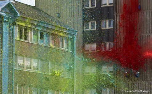
This is an incredible commercial for Sony Bravia. The first time I watched it I thought maybe it was photoshopped somehow... Well it has been color corrected, but it is actually paint, and actually buildings...
It's so neat for a lot of reasons...one thing that strikes me as interesting is that the buildings they used seem to be abandoned. If you watch the behind the scenes video you will see that there are broken out windows, rusted playground equipment, graffiti covered hallways - it appears to be projects, or slums that were used as the backdrop to an amazing commercial. I can't even imagine how much it cost to produce that!

Thanks Ryan for showing me this!