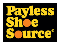

I think it is interesting that they chose to go with a symbol next to their brand name. It almost seems like they were trying to go for a "Nike" look with a swoosh. The color shift is also interesting - shifting to orange and gray instead of yellow and orange. Any thoughts on this logo redesign?
4 comments:
I like the original best personally. The new one seems blah.
It looks like market research determined that the single word "Payless" was more likely to stick in consumers' minds than "Payless Shoe Source". The new design kind of freshens the company as well, making it seem new.
The old one has nostalgic like quality , at least for our generation lol.
Thanks for the link add!!! I'll add you...also, I'm getting back into the graphic design thing...just not at UMSL.
~Jenny
Ah yes, another day, another Web 2.0 rendition of a corporate logo. Now, I'll admit that the previous Payless logo was, shall we say, stinky poo-poo. But that doesn't make up for the new one's me-too look.
Did someone steal this from a Yayhooray forum?
It'll probably end up being redesigned in 5 - 10 years. Meh.
Post a Comment