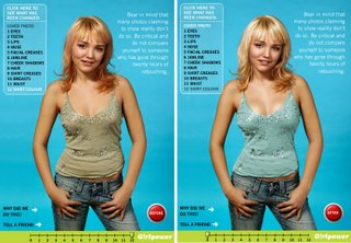
This is a very interesting demonstration of what magazines deisgners do with photos before the photos make it to the covers of magazines. Both of the above pictures are the same. The one on the left is the original, and the one on the right has gone thru about 20 hours of photoshop retouching.
- Eyes: Eye color is changed to bright blue, whites of eyes are brightened, eyebrows are moved up higher and cleaned up.
- Teeth: Gaps in teeth are filled in and whittened.
- Lips: Creases and wrinkles are removed, glossiness enhansed and upper lip made bigger.
- Nose: Width of nose is decreased, pores are removed and skin smoothed out.
- Facial Creases: Shadows on cheeks and bags under eyes are removed.
- Jawline: Jaw is reshaped, pimples and moles are erased.
- Cheek Shadows: Dark shadow alongside the cheek is added to make face look thinner.
- Hair: Hair color is changed to a blonder shade, gaps in hairdo are filled in with more hair.
- Shirt Creases: All creases and wrinkles in shirt are smoothed out, shadows removed.
- Breasts: Breasts are pumped up by adding shadows and patches of light.
- Waist: Both sides have been taken in to create a thinner, curved waist.
- Shirt Color: Color of shirt has been made more vibrant.
Click the "retouch website" link when you go to the page to see before and after pics at every step.
1 comment:
Actually, in the original picture, it was a guy.
Post a Comment